Hey Folks,
Round 3 closes up with 3 logos moving on:
- Bacon, Eggs, and Toast with 51%
- Furious George with 69%
- Fury (our first Women's team to move on) with 68%
- That makes 6 open, 2 mixed, and 1 women logo moving into the winners circle, but some cool women's, junior's, college's and master's logos are coming over the next few weeks.
- In the winners: 6 United States, 2 Canada, 1 United Kingdom
- Biggest vote getter (Note: depends on competition but fun anyway)
- Subzero - 355
- Condors - 339
- Furious - 259
- Clapham - 251
- Fury - 242
- Biggest percentage in grouping
- Subzero - 78%
- Furious - 69%
- Fury - 68%
- Condors - 60%
- Bacon, Eggs, and Toast - 51%
Rules = Vote once; don't vote for a team you're on.
Round 5 groupings are:
Group 1
 Missoula's Mental Toss Flycoons
 Mofo - Winnipeg, MA - Junior
Group 2

Metal - Cambridge, MA - Open
 Mischief - Suunyvale, CA - Mixed
 Michigan State - Burning Couch - College, Open
Group 3
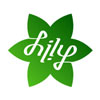
 Lily - Toronto, ON - Artist: Hilary Leung - Women
 Machine - Chicago, IL - Open
 Leeds, Leeds, Leeds - Leeds, England - Open
PJ


5 comments:
Mofo is the best logo in the game. That it's not in first is a sacrilege.
Mofo's logo is way dumb. It's a hockey stick for cryin' out loud. It's not even cleverly nonsensical. It's just dumb.
Now, that Lily logo is very nice.
Having been present when the elements of the HorrorZontal design were pieces of cardboard being pushed around on the shirt I have a thing or seventy to say about really cool ultimate team shirts. Not that the Zontal design will win at this stage but consider that most ultimate team names are lucky to last for two seasons let alone for more than two decades. That must say something about what a great design Lou and co. came up with!
Red on white or white on red for the varsity players and all the other color variations for the public.
The Zontals predecessor was W.A.F.G.O.G. (We're a Fun Group of Guys. Long live the Zontals and U.F.F. (Ultimate Fools' Festival) Kansas
Grady Boles
President
K.U. Frisbee Club 1982
Co-founder and Grand Poohbah
Boulder Secret Conviviality Society
est. 1996
Anonymous #1: hells yes.
Anonymous #2: clearly doesn't get the reference.
grand poobah grady: OK, sure.
Lily's logo is nice, and one of the better ones from Hilary Leung here (how many is she gonna have in this thing?). Monster's is OK, but not sure how they're beating MOFO. Or who Monster is exactly.
Metal isn't even trying. That's stylised lettering, not a logo!
Hilary is a guy.
Yes, yes he is.
Monster is (mainly) a league team here in Toronto.
Post a Comment